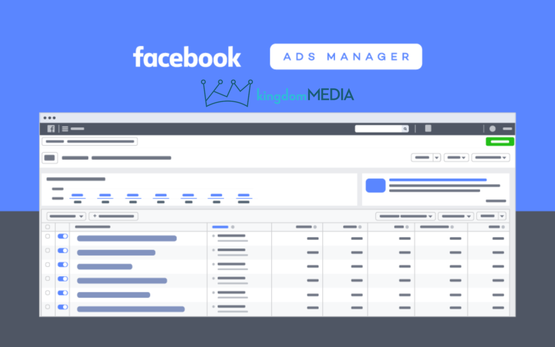
Main Dashboard
Ad Manager has Changed!
So, you might have noticed that your Ad Manager looks completely different. If you are like us, you probably are thinking, “Why change something that seemed to work just fine?’ The good news is that the change is mostly just cosmetic.
Here is an example of the buttons that have changed-
See, it’s not too much different than before.
Another cool thing about the new design is if you hover over the left menu, it tells you exactly what it is, instead of you having to remember what all of the icons mean.
Search & Filter
Now that the search and filter are combined, you can begin searching for a keyword in one level and then add filters- There are several more filters as you scroll down,
Duplicating Ads
Duplicating a Facebook Ads Campaign, Ad Set, or Ad looks a little different in the new layout. Just be sure to duplicate at the level you mean to, because you will be duplicating everything under that section.
New Inspect Feature
The Inspect feature is a bit hidden. You have to put your mouse over the icon to find it. After clicking it, the right side of your dashboard will expand and you can see delivery insights and even some recommendations.
**Just be careful on advice that Facebook gives you because usually, it is stuff that will help them out and not necessarily you.
So, that is some info on the new Facebook Ads Manager. We hope it helped you understand the dashboard a little more clearly.
Let us know what you think of the new layout. Do you like it or do you prefer the old one?


